Candlestick Chart Patterns: The Complete Beginner's Guide
By Bharat · July 5, 2026
A candlestick chart shows the same information a line chart does — price over time — but it shows more of it. Each candle is a small argument between buyers and sellers over one period of time, and once you can read that argument, a chart stops being a squiggly line and starts being a record of who was winning.
The anatomy of one candle
Every candle has four numbers baked into it: the open, the high, the low, and the close.
- The body is the thick rectangle between the open and the close.
- The wicks (or shadows) are the thin lines above and below the body, marking the high and low reached during that period.
- The color tells you the outcome: a green (or white) body means the close was higher than the open — buyers won that round. A red (or black) body means the close was lower — sellers won.
That's it. Everything else — every named pattern — is just a specific arrangement of body size, wick length, and color that tends to repeat because human behavior around fear and greed tends to repeat.
Why patterns matter (and why they're not magic)
A pattern is a snapshot of who's in control. A long lower wick means sellers pushed price down hard and buyers pushed it right back up before the period closed — that's a real, visible fact about that candle. What it is not is a guarantee about the next candle.
Patterns work as a way to read the balance of power at a specific point on the chart, not as a standalone signal to buy or sell. The pattern earns your attention. The trend, the level it forms at, and the volume behind it earn your decision.
Patterns worth learning first
There are dozens of named candlestick patterns. Most traders only ever need a handful, learned properly, rather than all of them, learned shallowly.
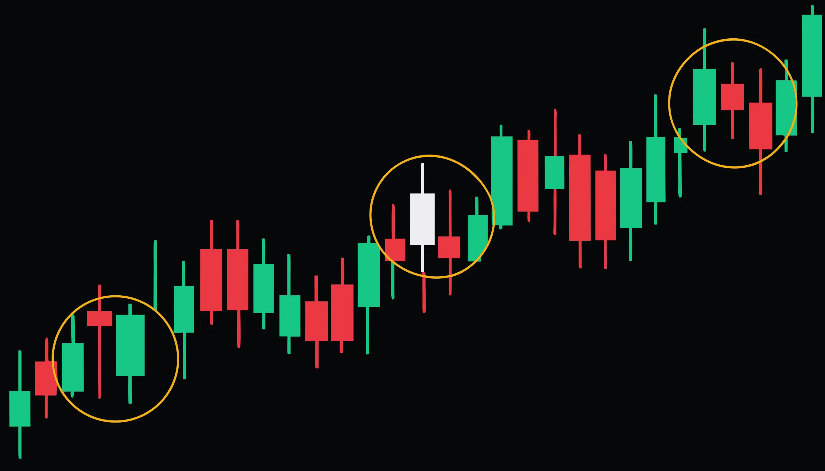
- Hammer — a single candle at the bottom of a downtrend with a long lower wick, suggesting sellers lost control late in the session.
- Doji — a candle where the open and close are nearly equal, showing genuine indecision between buyers and sellers.
- Morning star — a three-candle sequence (down, indecision, up) that shows a downtrend losing momentum and reversing.
Start with the hammer, doji, and morning star. Learn to spot each one on a real chart, in context, before working through the rest.
How to actually use this
A pattern by itself is one data point. Before you weight it, ask what trend it's forming in, whether it's sitting at a level that already matters (a prior high, a prior low, a round number), and whether the volume behind it backs up the story the shape is telling. A hammer in the middle of nowhere is a shrug. A hammer at a level you were already watching, on above-average volume, is worth paying attention to.
Ready to put this into practice?
Structured courses on price action, options, and risk management.
Browse courses