Chart Patterns in Trading: The Complete Guide
By Bharat · July 5, 2026
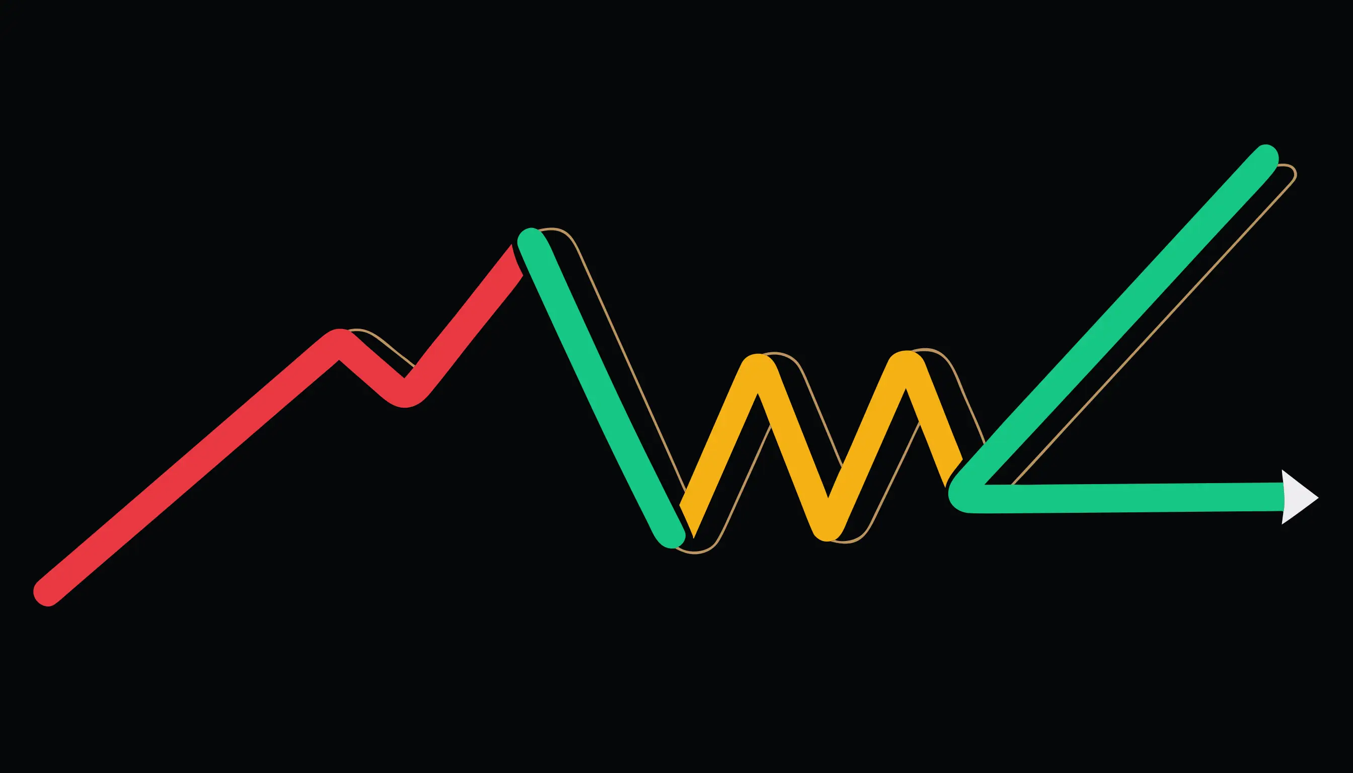
A candlestick pattern is a story told in one to three candles — a few hours or days. A chart pattern is the same kind of story, but told over weeks or months, using the overall shape of the price line rather than any individual candle.
What makes something a chart pattern
Zoom out far enough on any chart and price stops looking random. It leaves behind shapes — peaks, troughs, ranges, breakouts — that repeat across markets and timeframes because the same crowd psychology (greed near highs, panic near lows, hesitation at prior levels) repeats. A chart pattern is a name for one of those recognizable shapes.
Reversal patterns vs. continuation patterns
Most chart patterns fall into one of two categories:
- Reversal patterns mark the point where an existing trend is running out of steam and turning the other way.
- Continuation patterns mark a pause inside an existing trend before it resumes in the same direction.
Knowing which category a pattern belongs to matters more than memorizing its shape — trading a continuation pattern as if it were a reversal (or the reverse) is one of the most common beginner mistakes.
Reversal patterns worth learning first
- Head and shoulders — three peaks, the middle one highest, marking the end of an uptrend.
- Double top — two peaks at roughly the same height, marking resistance that held twice.
- Double bottom — the mirror image, two troughs at roughly the same depth, marking support that held twice.
All three share a structure: price tests a level, pulls back, tests it again, and this time fails to continue — that failure is what the pattern is actually capturing.
The neckline or support/resistance line is what confirms it
Every one of these patterns has a specific level — a neckline for head and shoulders, a support or resistance line for the double patterns — and the pattern isn't considered complete until price actually breaks through that level. Spotting the shape early is only half the job; waiting for the break is what turns a shape into a signal.
Same rule as candlesticks: context first
A chart pattern's reliability depends heavily on the trend it interrupts, the volume behind the breakout, and how cleanly the level in question has been respected before. A textbook-looking shape with no real trend behind it, or a breakout on weak volume, is far less trustworthy than the same shape after a strong, extended move.
Ready to put this into practice?
Structured courses on price action, options, and risk management.
Browse courses